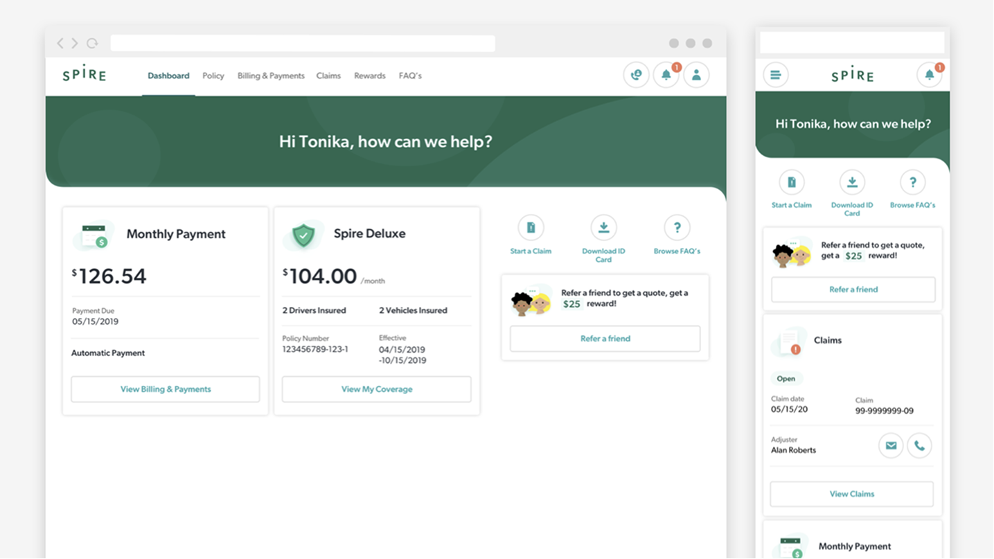
Spire by Nationwide
Launched native mobile app to manage metrics-based pricing for car insurance
2019 - 2020
Nationwide wanted to stop charging millennials for coverage they don't use, and start charging them for how they actually drive.
CATEGORIES
B2C
Native Mobile App
Web Application
TEAM
Design Lead (Myself)
1 Visual Designer
1 UX Designer
1 Design Reseracher
3+ Engineers
OVERVIEW
Nationwide's main app only handled policy management, at the time it had no way to reward good driving with better pricing. The business wanted to test usage-based insurance, using telematics to track driving behavior and adjust cost accordingly. But they weren't willing to risk that experiment on their primary app. Instead, they spun up an entirely new brand, Spire, and gave us 12 months to build it from nothing.
I joined as design lead on a small cross-functional team, tasked with building a brand-new app, under a new brand, using a technology that only works if users trust it enough to hand over their driving data, inside one of the most heavily regulated industries there is. The real wild card was an outside vendor holding a huge piece of the puzzle, brand identity, with no clear delivery date. We kept building and hoped the pieces would meet in the middle. Eventually, we stopped hoping and built a plan B.
The result was Spire: a usage-based insurance app that let drivers see exactly how their driving affected their rate, and take control of it.
MY ROLE & RESPONSIBILITIES
Design Lead — Brought onto the team specifically for the ability to bridge UX and Visual design work, while the other designers on the project were strong in one direction or the other. Owned the end-to-end user journey across a 12-month engagement.
- Owned and maintained the user journey end to end
- Designed screens, workflows, and micro-interactions across the app
- Bridged UX & visual design, applying the system to core flows
- Built and demoed prototypes for developers and product owners
- Ran strategy workshops and partnered with research to shape MVP scope
- Drove stakeholder alignment and design decision-making
My core skill was bridging UX and visual design, and that combination shaped everything else I contributed, from research partnership to stakeholder alignment to keeping the team moving as one.
OUTCOMES
GROUDNED
Data-driven personas
Every design decision was built around a real, research-backed user, not a guess
ENABLED
Pricing, personalized
Rates shaped by real driving data instead of flat averages, a first for this brand
VALIDATED
88% SUPR-Q score
The majority of people found it easy to use and more valuable than their current provider
LAUNCHED
Idea → Reality
Shipped a native app, responsive web experience, and an entirely new brand within a single 12-month engagement
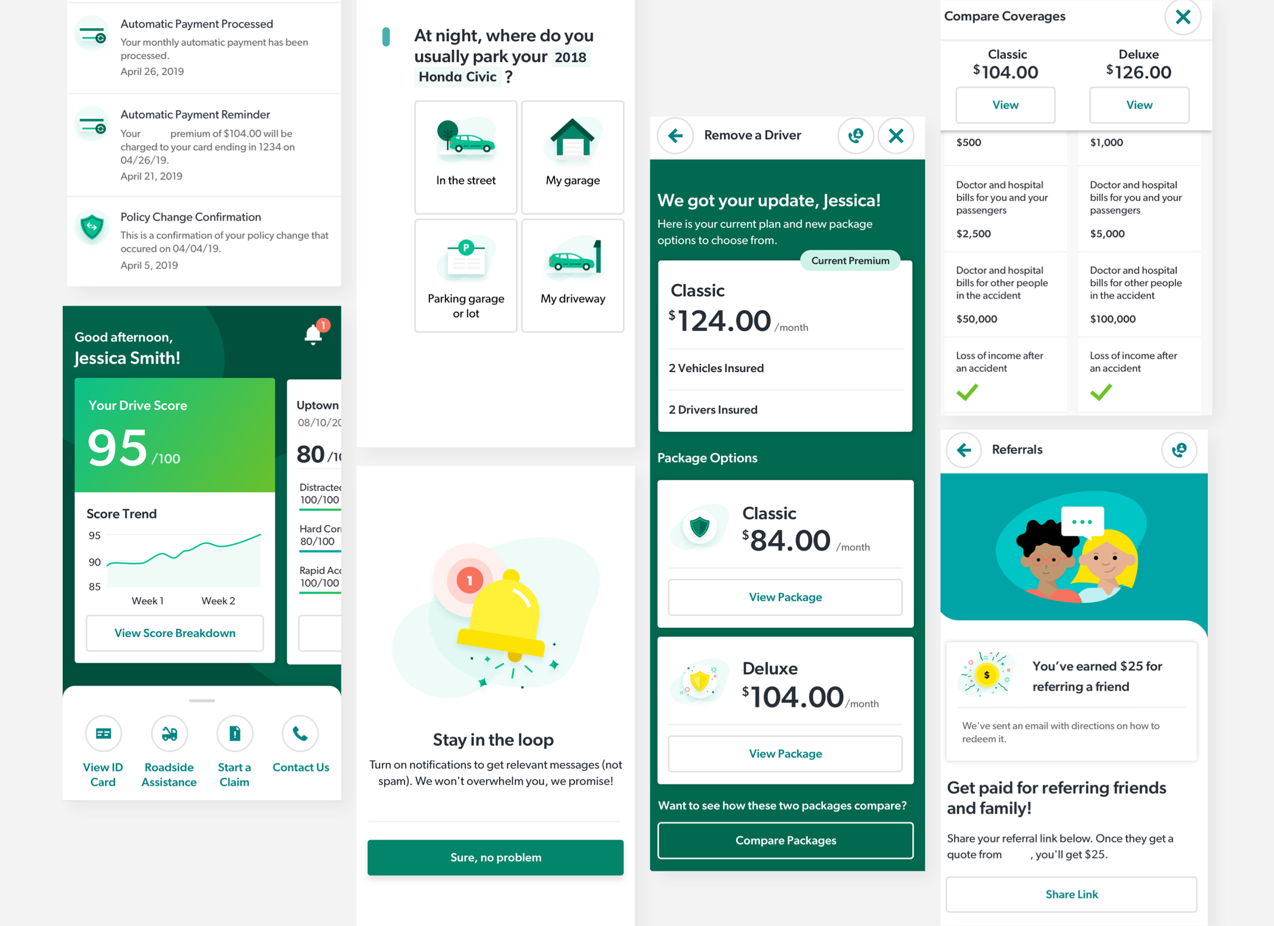
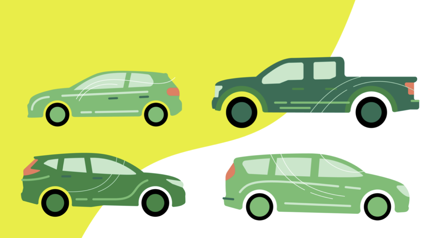
Above: Example of branded elements that served as both illustrations within the product and moments of brand expression
Data doesn't build itself
DISCOVERY
Nationwide had already paid a well-known research consultancy to figure out what a millennial-focused insurance product should look like. What came back was thorough, dozens of pages of quantitative research and a persona to design against, but nothing like an actionable plan to build a product. Nationwide didn't need another deck. They needed something real.
That gap became our opening. Our team ran a one-day hackathon, taking that same research and turning it into tangible prototypes and proof of concepts, proof that we understood not just the data, but how to turn it into story, interface, and a real experience people could hold in their hands. It was enough to convince Nationwide we were the right team to build what they actually wanted.
From there, real discovery began. We ran a design strategy workshop with Nationwide's subject matter experts to map business processes, service flows, and desired features against what we already knew about the target user, work that produced Tonika, the persona every design decision would be measured against from that point forward. A visioning workshop followed, a chance to rapidly prototype what the experience could look like at a high level: layout, tone, proto-system elements, all built around values like transparency, simplicity, and a conversational voice.
It wasn't meant to be final. It was meant to sell a vision and give the team something concrete to build toward.
TARGET PERSONA

Tonika, A Self-reliant millennial
Married, bachelor's degree, single-family homeowner. Drives a hybrid, considering full electric. Household income: $108k.
- Wants clear, actionable information when shopping for insurance, and to feel respected and heard
- Prefers finding her own answers online, confident about budgeting, values time over money
- Comfortable with technology: manages finances online, uses digital assistants, active on social media
My Role & Responsibilities
My involvement in this phase was hands-on from the start: planning and running the on-site creative workshops with the client, sketching concepts in real time, and using Design Sprint methods like crazy 8s and paper prototyping to get ideas out fast. Sketching has always been how I think, putting pen to paper gets ideas out of my head faster than staring at a blank screen ever does.
All gas, no brakes
APPROACH
With only early directional thinking to go on, and full brand expression still pending, we couldn't afford to wait. My visual design counterpart began building a utility-focused foundational system, while I worked with my UX teammate to frame the core user journey. My job was to move between the two, making sure the visual language and the UX decisions stayed aligned as both took shape at the same time. Every screen got measured against three design principles: conversational, transparent, and always giving the user a clear next step.
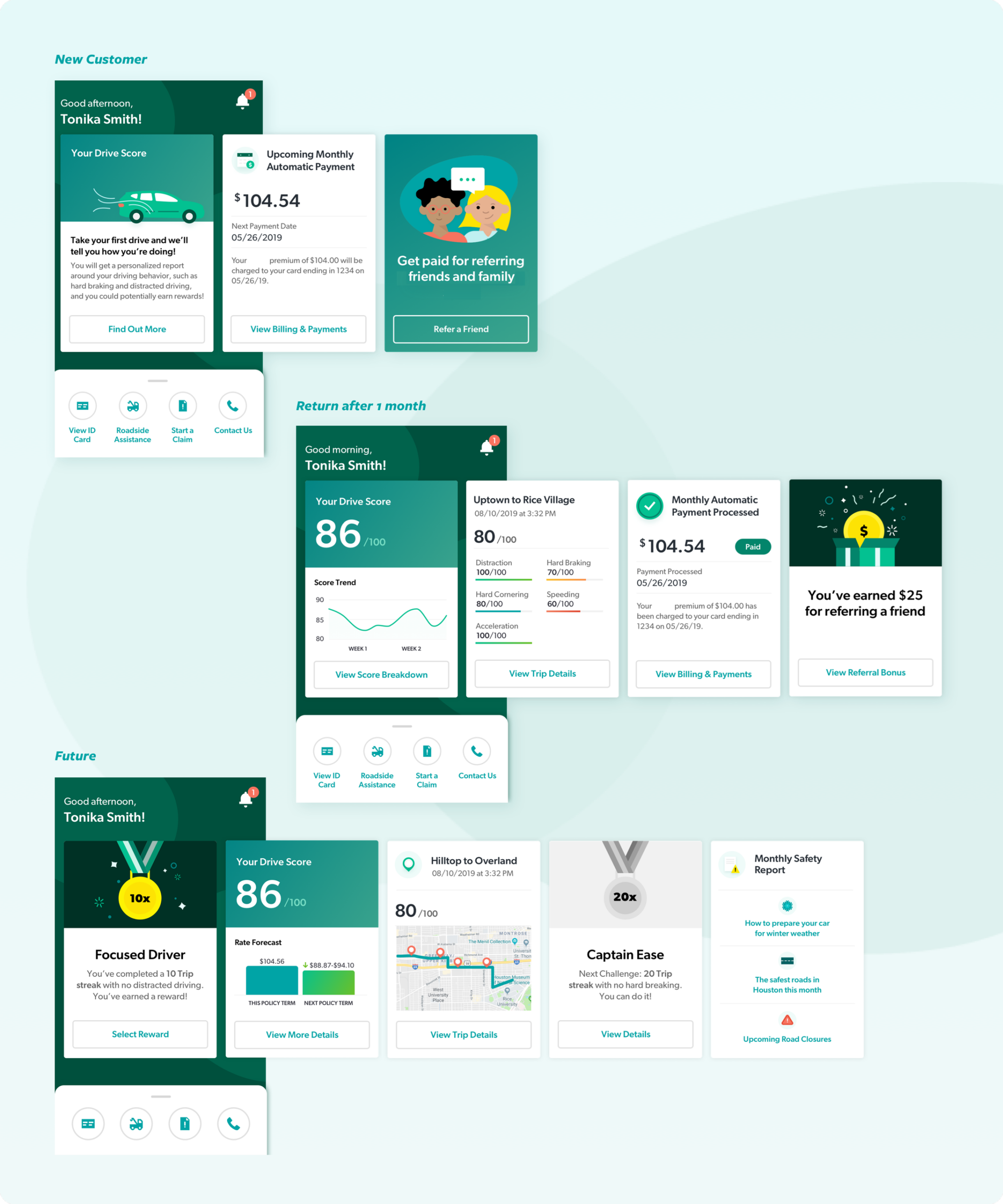
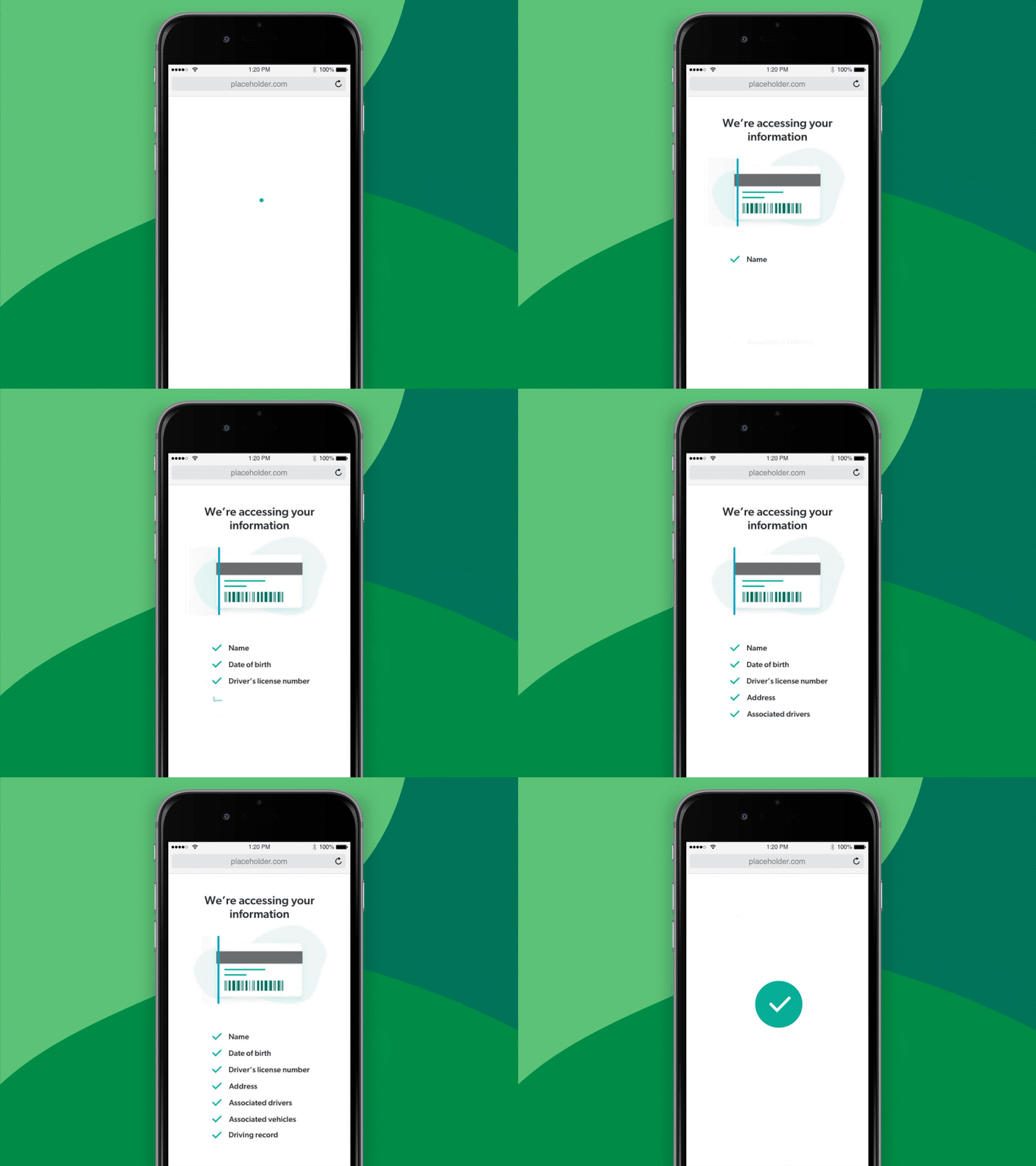
Telematics was the piece that needed the most care. The core idea, tracking driving behavior to personalize pricing, only works if people don't feel watched or judged by it. We went through multiple layout iterations on something as small as showing a user their drive score, testing different ways to present the same data before landing on one that felt informative rather than punitive. The framing we settled on was empowerment: giving drivers insight into their own habits.

My Role & Responsibilities
My involvement in this phase was bouncing between UX and visual workstreams. We had two teams split by feature set, and I led design on one of them, planning the IA, building wireframes for user journeys, testing with users and stakeholders, then applying the visual language to make it real. I was also designing and animating the micro-interactions used throughout the app.


Challenges
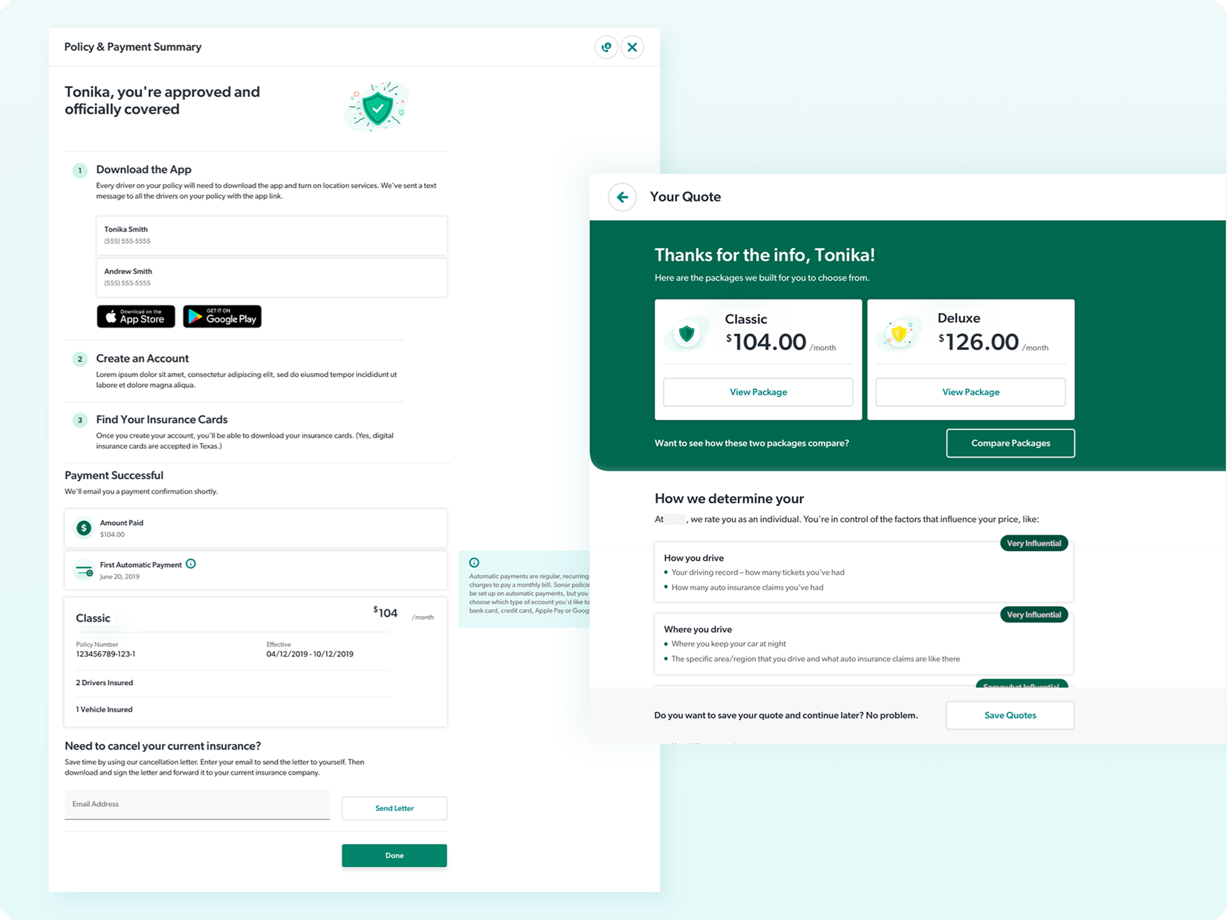
Nationwide wanted this to be an app-only experience, clean, fast, mobile-first. But legal requirements meant they had to offer a way to purchase online too, so partway through, our scope grew to include a responsive web experience for policy purchasing and management. That wasn't a preference, it was the law, so the web version had to get it right.
By the time it shipped, web had about 70% feature parity with the app, enough to handle policy purchase and management on its own, even though the full experience still pointed people toward downloading the app.

Navigating a challenging situation
REFINEMENT
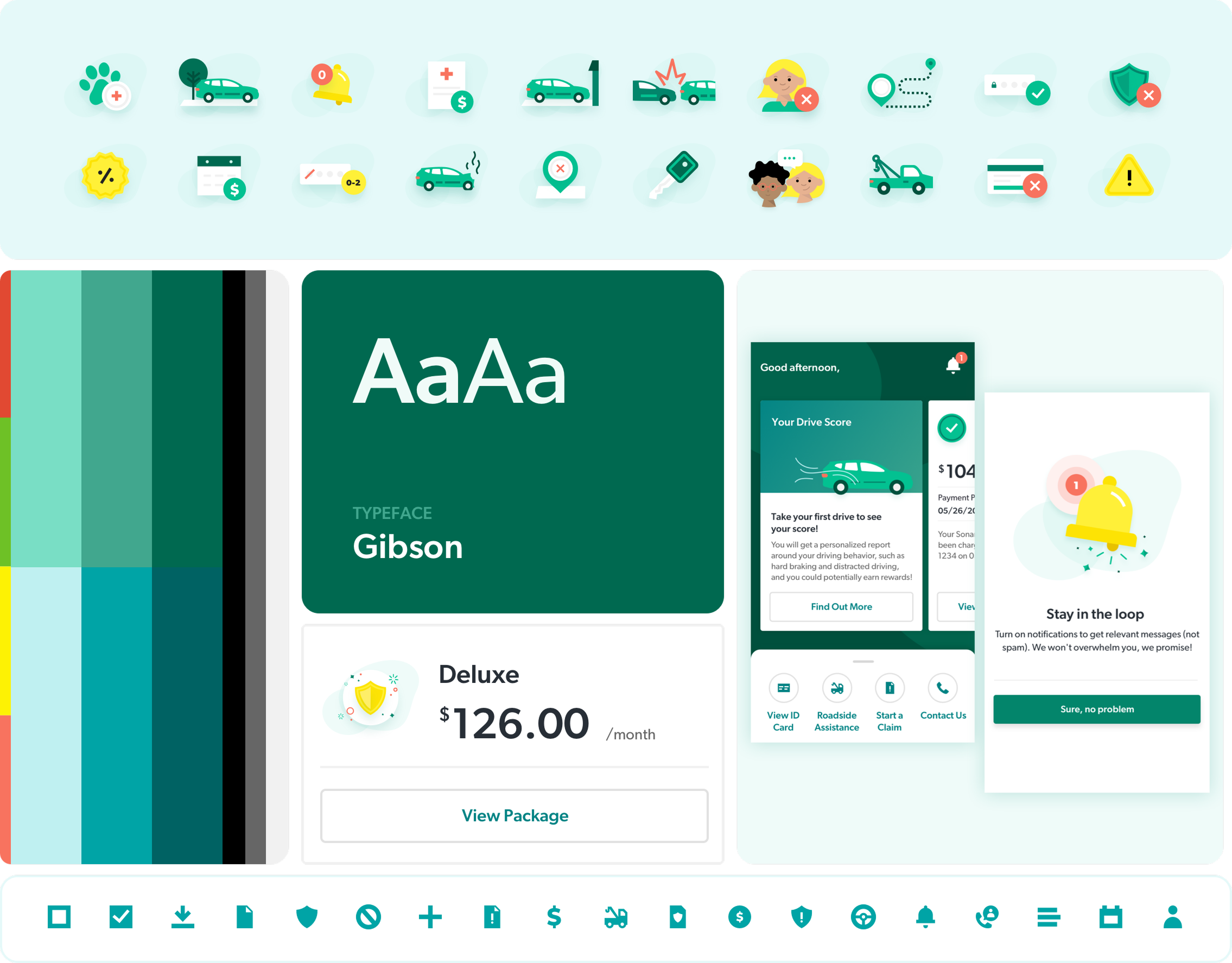
Somewhere around this point, we still didn't have a finished brand, just a handful of early directional pieces: a typeface, a few colors, some illustration examples. With the pilot launch approaching and no full system in sight, we took what little we had and built the rest ourselves, filling every gap the outside branding agency hadn't gotten to yet.
By the time their full direction arrived, the client had already seen what we'd built and preferred it, and the agency ended up needing to follow our lead instead of the other way around.
My Role & Responsibilities
My involvement was working with my design counterpart in building out the visual system from those few early inputs, keeping it consistent as it expanded, and making the judgment calls on where to extend it versus where to wait, all while managing a vendor relationship that required patience as much as design skill.

Challenges
That relationship took real effort to manage well. The agency was a large, well-known name, and carried itself accordingly, confident in a process that didn't leave much room for questions, even while they were behind schedule and clearly finding their footing applying brand to a live digital product. It would have been easy for that dynamic to turn adversarial. Staying level-headed instead, and keeping the focus on the work rather than the friction, was what let us ship something polished and well thought through.

TAKEAWAYS
Our efforts to reimagine car insurance for millennials resulted in a product that offers a user-friendly, transparent, and empowering experience.
" The big brother concept doesn't hurt me. If that's what lowers my rate, more power to me. "
The start of a new journey
This project asked a lot in a short window: adopt a brand that wasn't finished yet, integrate a new kind of technology in telematics, and do it all on a demanding timeline. We met each of those challenges with the same approach, stay close to the user, adapt as reality shifted, and keep moving instead of waiting for perfect conditions.
Spire launched as a pilot, and the testing data told an honest story. Most participants found it easy to use and more valuable than what they already had, real proof that a persona named Tonika wasn't just a research exercise, she was who we were actually designing for. But the scores weren't the whole picture. Some participants were candid about their discomfort with the idea itself, handing over driving data to a company that would use it to set their rate. A few said the experience felt more complex once telematics entered the picture, even when they liked what it offered.
That tension is the real lesson this project taught me. Good usability doesn't automatically earn trust, especially when you're asking people to hand over something as personal as how they drive. The best thing we did wasn't polishing the interface until it looked confident. It was designing every interaction to be honest about what we were asking for and why, and letting the product earn trust instead of assuming it.
Master of karate and friendship for everyone.
The End