
Spire by Nationwide
Launched native mobile app to manage metrics-based pricing for car insurance
2019 - 2020
I helped take Spire, Nationwide's usage-based car insurance, from 0 to 1 in 12 months, designing business-critical flows that let drivers track how they drive and what they pay.
ROLE
Senior Experience Designer, design lead for one of two sprint teams
TEAM
3 designers (including me),
1 design researcher,
3+ engineers
SCOPE
Native mobile app, responsive web, motion design and brand system
STATUS
Shipped; later folded into Nationwide's core offering
OUTCOMES
TESTED
Live pilot testing
Tested with real drivers in US pilot cities, with rates shaped by how they actually drive
LAUNCHED
Idea → Reality
Shipped a native app, responsive web experience, and an entirely new brand within a single 12-month engagement
VALIDATED
Easier, high value
Research findings suggested most participants found it easy to use and had potential to be more valuable than their current provider
ADOPTED
Driving it home
The success of the app meant Spire's functionality was eventually carried into Nationwide's main app and offered as a staple for policy holders
PROBLEM
Nationwide's main app only handled policy management. At the time, it had no way to reward good driving with better pricing. The business wanted to test usage-based insurance, using telematics to track driving behavior and adjust cost accordingly, but they weren't willing to risk that experiment on their primary app. Instead, they spun up an entirely new brand, Spire, and gave us 12 months to build it from nothing, in a heavily regulated industry, on technology that only adds value if people trust it with their driving data.
MY ROLE
The engagement was won through a hackathon that turned Nationwide's foundational research into working prototypes. I joined at kickoff as one of three designers, working in the space between UX and visual design.
- Owned and maintained business critical user journeys, end to end
- Designed screens, workflows, and micro-interactions across the app
- Bridged UX & visual design, applying the system to core flows
- Built and demoed prototypes for developers and product owners
- Helped run design and strategy workshops to shape scope
- Drove stakeholder alignment and design decision-making
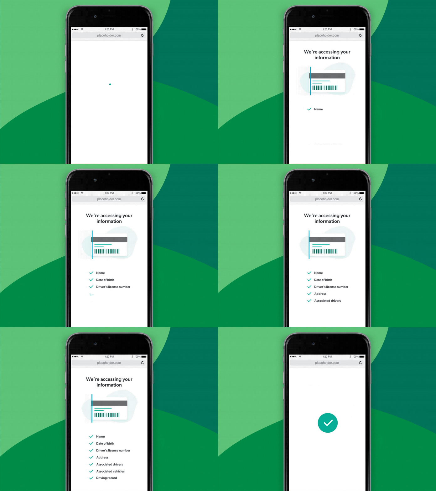
Above: Example of micro animation work I designed within the product to illustrate moments of brand expression
All gas, no brakes
THE DECISIONS
Two things shaped how we worked. The brand was in an outside vendor's hands and the timeline was fixed, so we built in parallel and adjusted as pieces arrived. And because the product only worked if people trusted it, every screen was measured against three principles: conversational, transparent, and always giving the user a clear next step.
We turned inherited research into a vision.
Nationwide had a thorough study from an outside consultancy but no plan for what to build. I helped run on-site workshops with their experts, sketching concepts in real time to turn findings into a direction the team could build toward.
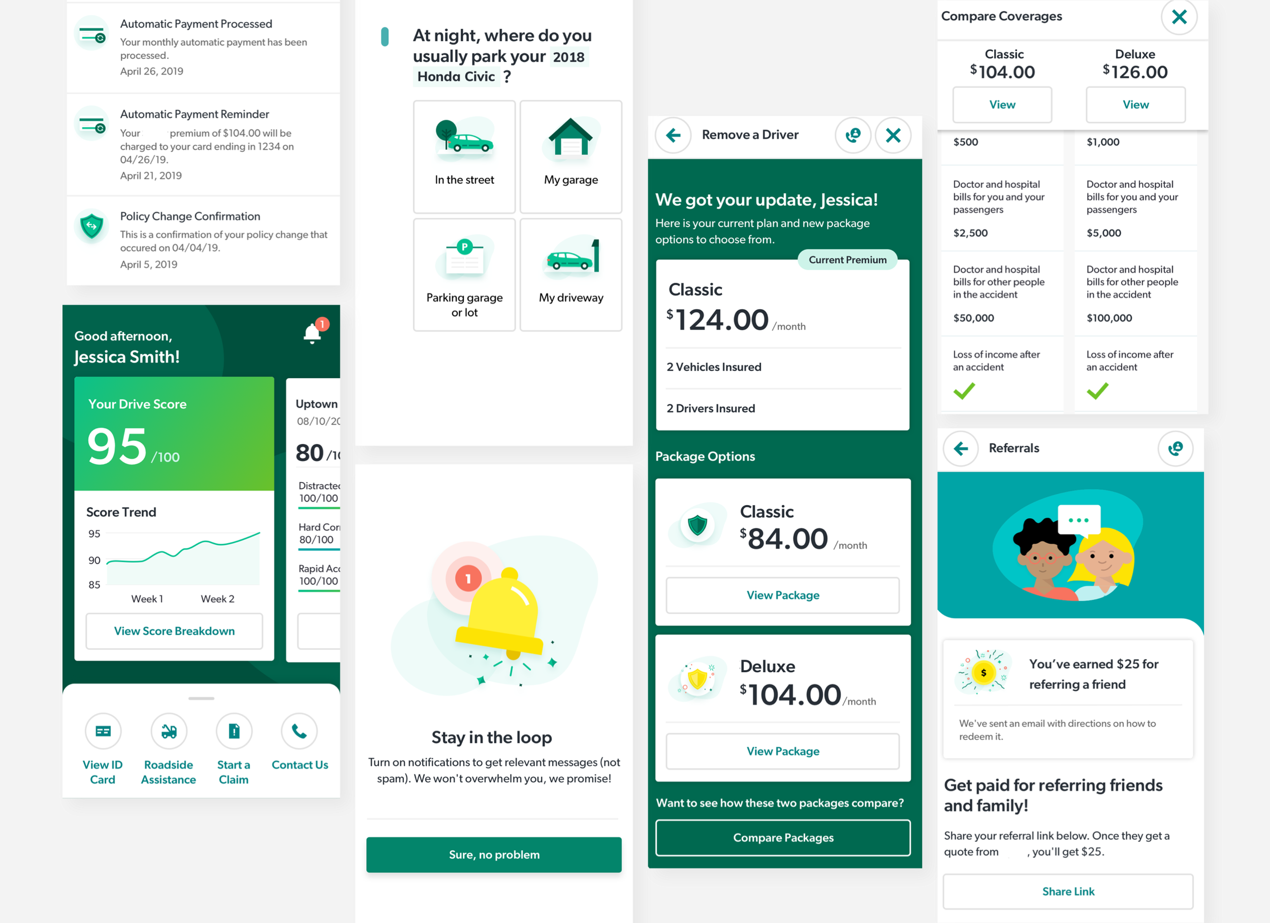
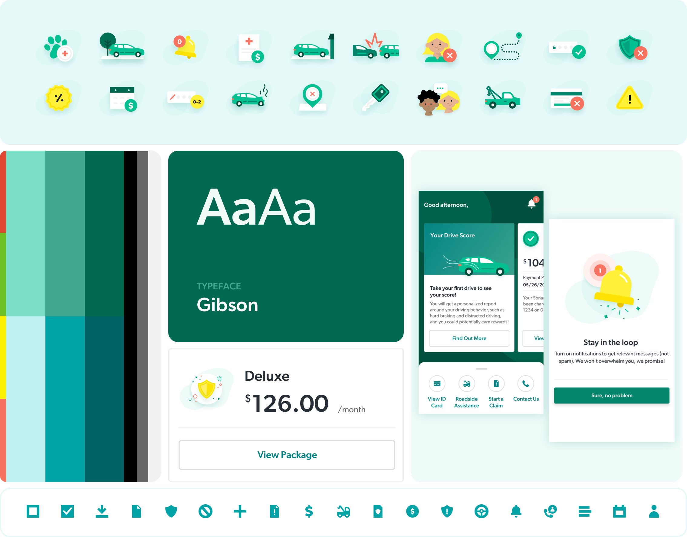
We built the brand instead of waiting for it.
With the agency's brand running late, our visual designer extended a few early inputs into a full system while I applied it across layouts and interaction patterns. When their direction arrived, the client preferred ours.
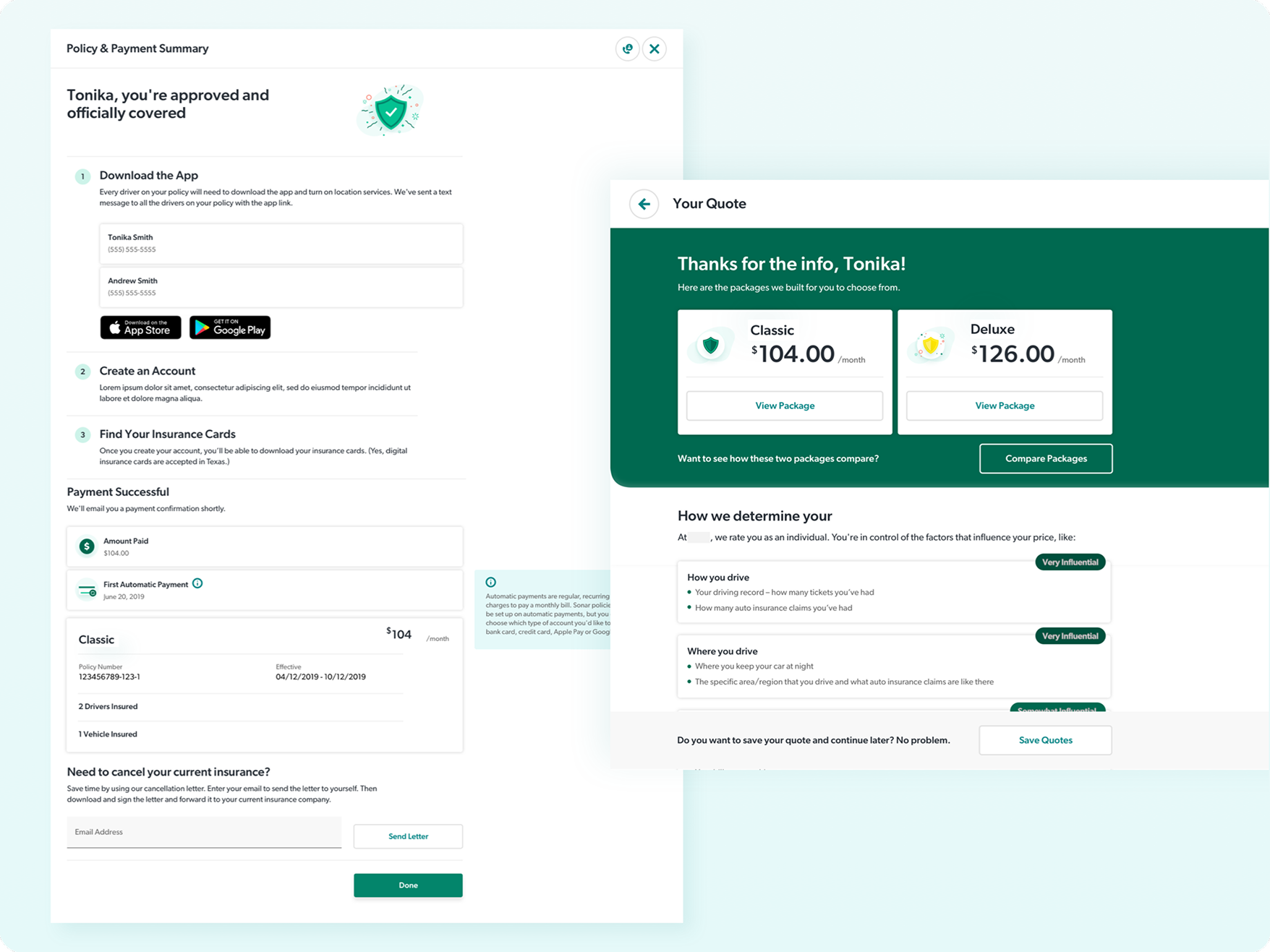
We moved web from a secondary channel to a primary way to buy.
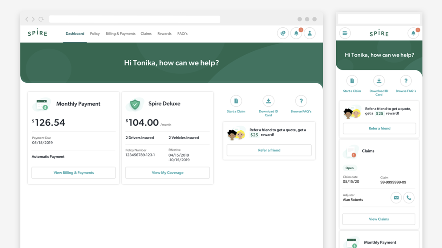
A web version was always planned, but the app was meant to be where people bought a policy. When an online purchase path became a requirement, we raised web's priority, and I adapted the app's patterns to make it work. It shipped with about 70% feature parity, enough to buy and manage a policy without the app.
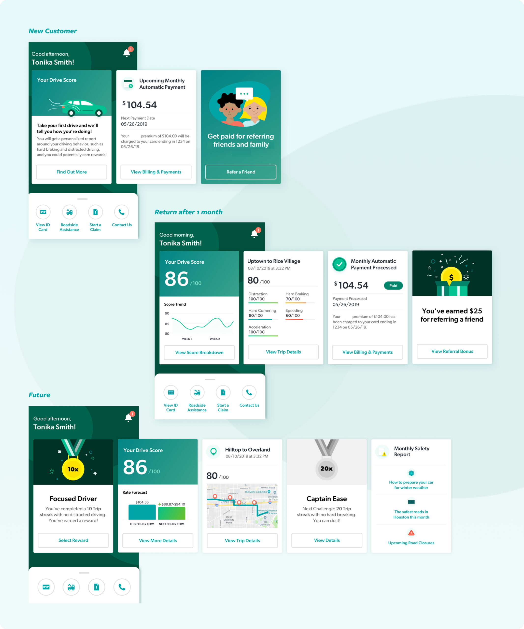
Drive score should feel informative, not judgmental.
Telematics only works if people don't feel watched. I prototyped multiple layouts for our researcher's testing sessions, landing on one that framed the score as insight into your own habits rather than a grade.
Usability alone doesn't earn trust. When you're asking for someone's driving data, the design has to be honest about what you're asking for and why.

TAKEAWAYS
Spire launched as a pilot in select US cities before eventually being folded into Nationwide's core app. A few lessons have stuck with me since:
- You can't wait for perfect inputs. The brand was never finished on schedule. Building around the gaps kept us moving and gave the client something better to react to.
- Usability isn't the same as trust. Testing showed people could find the app easy to use and still be uneasy about sharing their driving data. Trust has to be designed for on purpose.
- Generalists hold things together. Being fluent in more than one discipline turned out to be worth more than being the deepest in any single one.
Master of karate and friendship for everyone.
The End