
Going places
Going places
In my time as the Design Lead on the Toyota account, I contributed to a number of concepts and initiatives introducing new features, improvements, and refinements to Toyota's digital presence. Below you'll find a detailed documentation of my design process.
While I helped contribute to UX as member of the product strategy team, my contributions and thought process were largely focused on visual design and interaction/motion design. So while I try and include the technical details and all of those juicy metrics that you crave, the reality is that my UX partner is more of an expert on that and I help her to translate that data into visual design. What you’re reading is my side of the story.
Role
Design & prototype, Interaction design, Design direction, Design system
Agency
Connective DX

The problem
The problem
The client wanted to revamp the way people pay their lease online. I was brought in to help illustrate new ways in which users could interact with the site.
Challenges
The challenge
This project started off with a few challenges. One being that the client wanted us to adopt their project management methodology. The second being that the product owner wanted innovation but her superiors wanted to focus on MVP. This was (and still is) a struggle to balance the demands of two or more important stake holders.
Product Iteration One & Exploration
Product Iteration One & Exploration
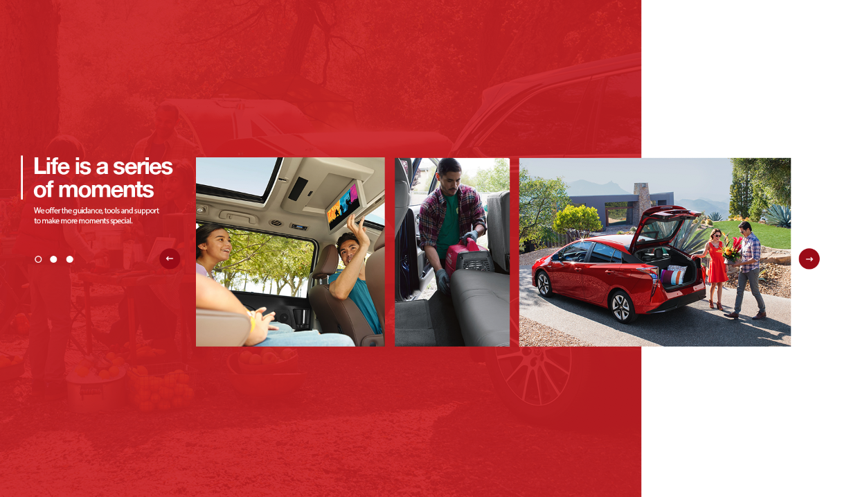
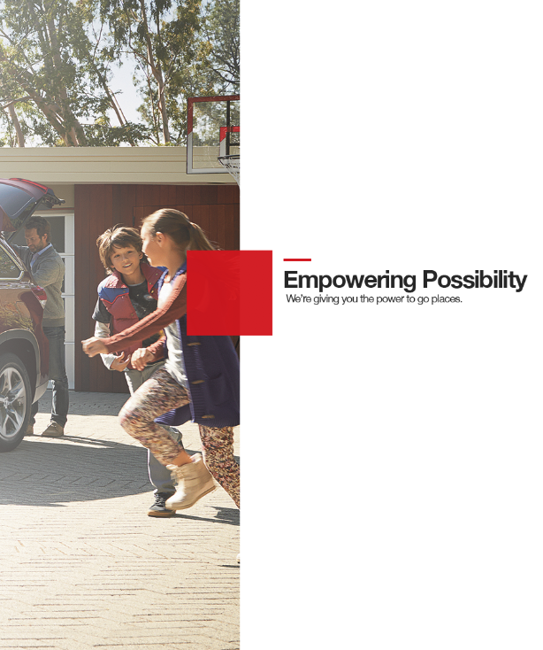
I enjoy this part of the project the most because I get to make screens and prototypes in principle really quickly. It’s the most broad and diverse I get to be before needing to start to narrow the focus on a design system. What you’ll see here are my initial thoughts and rough comps, sketches & motion tests going in to iteration one. What I’m trying to solve here is how can we think about the interaction pattern differently?.
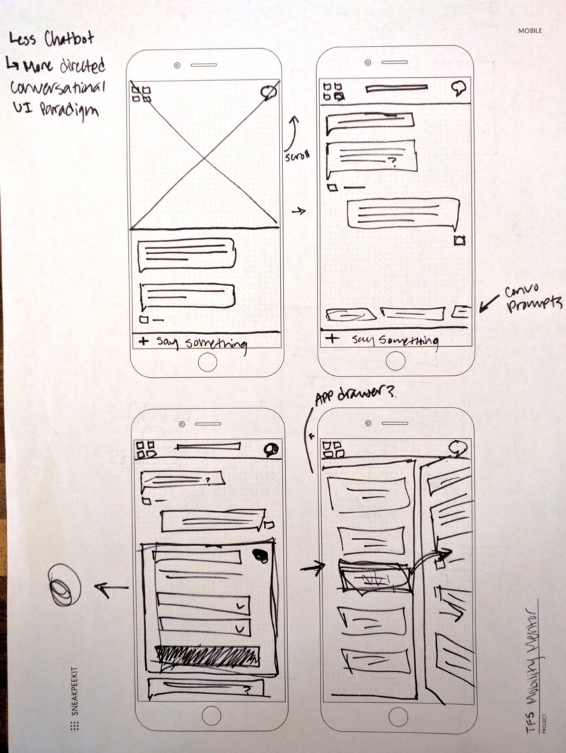
Currently, users come to the site once a month to pay their bill or they come once to set up autopay and do not return until the end of their lease. One of Toyota’s business goals is to get users to come back to the site and learn more about lease options. This is important to them because the more they can engage the user and decrease friction, the more likely they will become a repeat customer. The mentor idea came from a thought to make a chat based UI. A chat bot could potentially get the user from point A to point D and skipping everything in between. We were all really excited about this but due to Site Core and scope constraints, this was not feasible, so we had to pivot.
Below: Sketches showing ideas and concepts for mobile focused interactions. I like to make notes in the margins to help direct my efforts when storyboarding and prototyping.
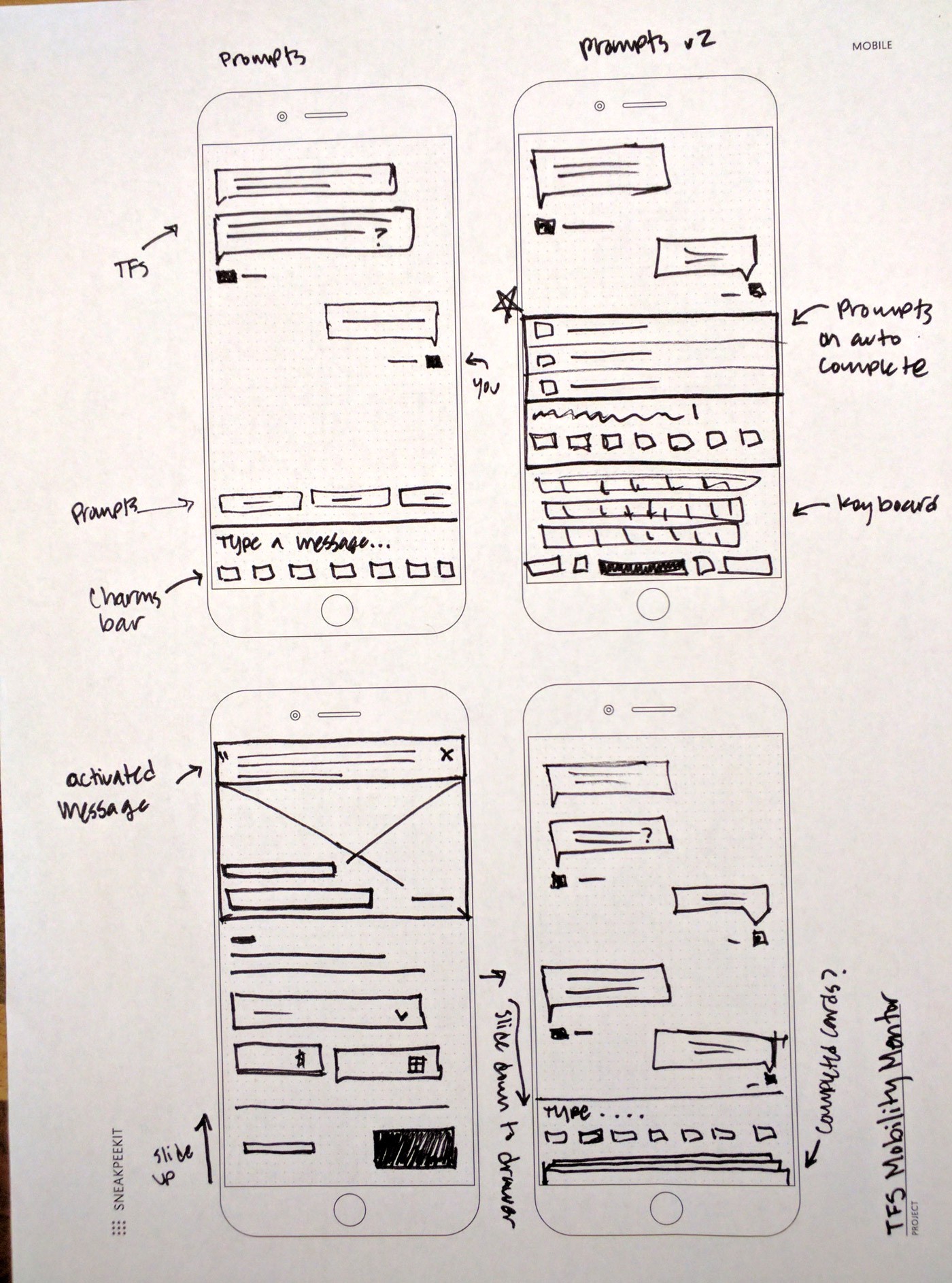

From the sketching exercise I took a few of the ideas I was most excited about and started to put together some quick mock ups in Sketch. This allows me to copy over elements into Principle so that I can quickly get things moving.

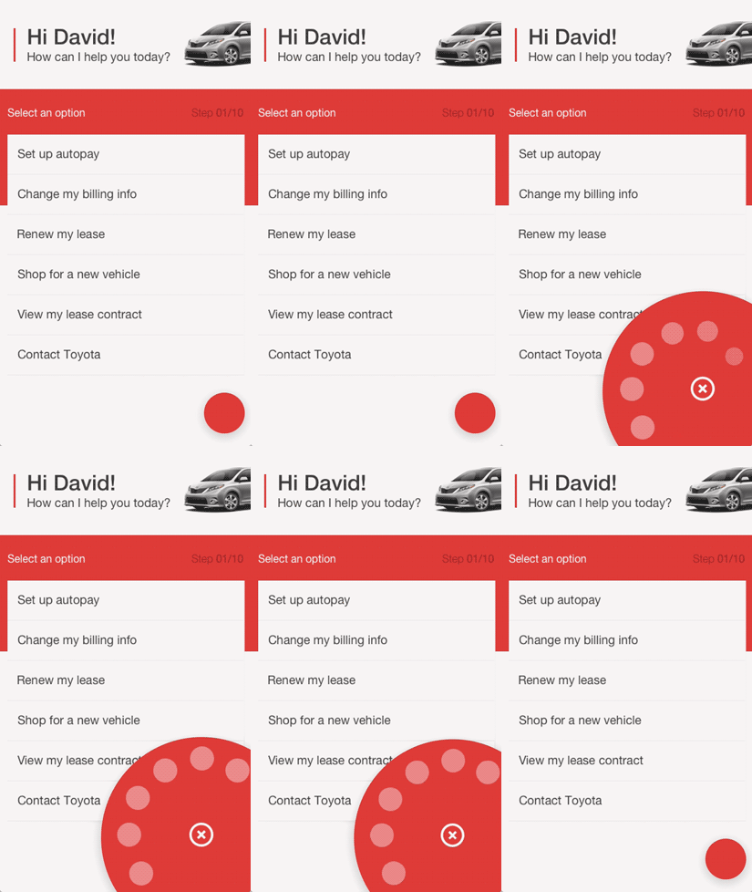

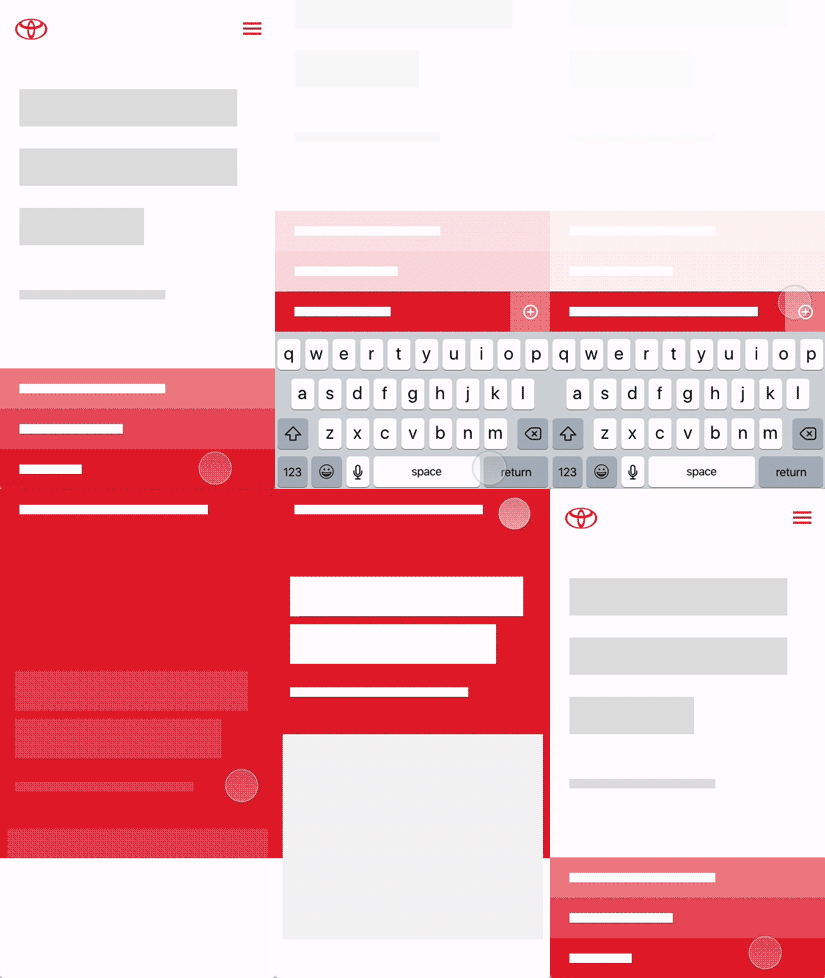
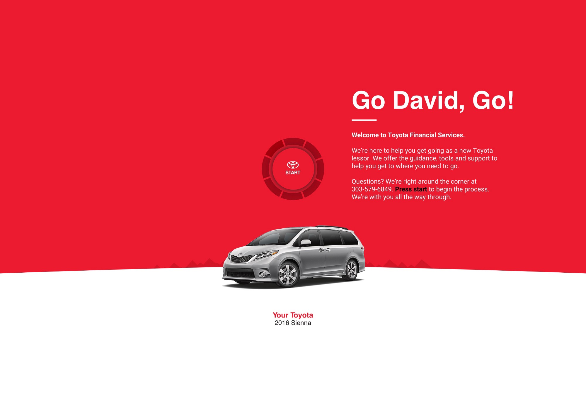
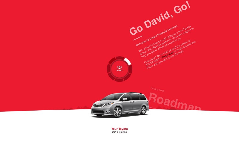
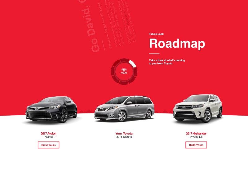
Playing with the idea of using a power button to act as a radial marker. You would turn the dial in order to advance screens. The rest of the UI would live in this red space until you turned the dial to something else.
Product Iteration Two — Refinement & Testing
Product Iteration Two — Refinement & Testing
This stage of the project we decide what gets to move on into testing and then go in front of the client. The UX architect that I partner with manages the testing parameters and then executes the tests. After testing has been conducted we regroup and comb through the feedback to see where we need to alter our assumptions and our designs.
In this iteration we moved away from an actual chat bot but tried to see if we could capture the main elements of the concept into a design that pulls in components as the user takes action. So all users would essentially have the same, or very similar starting points, and then they would “build” a new experience as they interacted with the site. The obvious challenge to this new idea is how to deal with information that needs to be persistent without needing to go through the whole experience every time you need that bit of information.
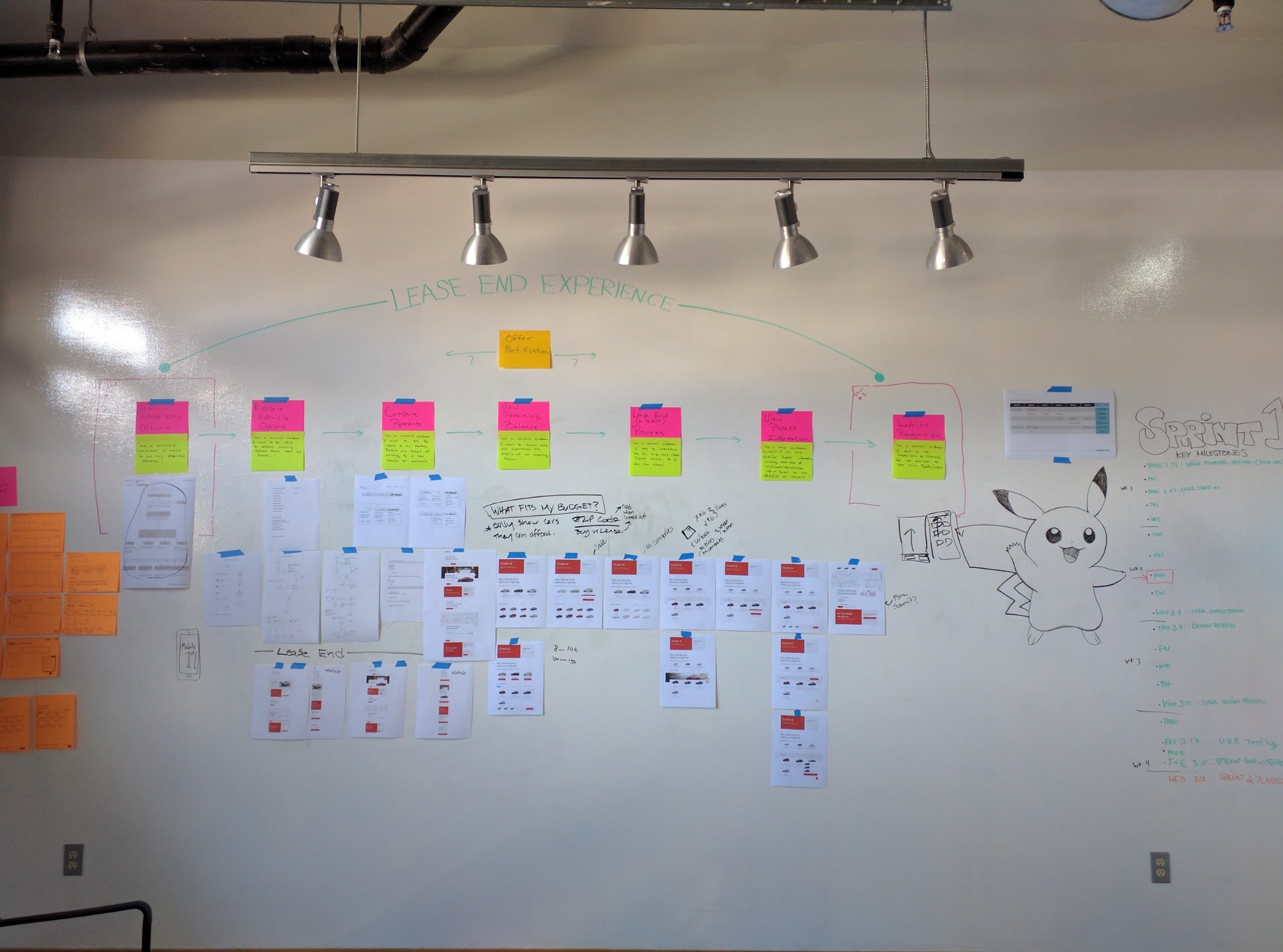
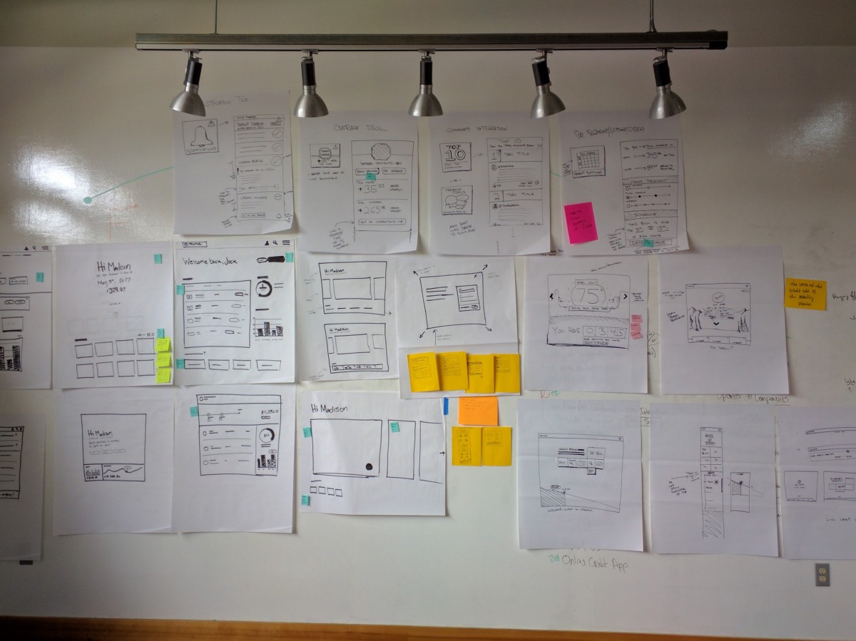
Below: The Toyota wall. Including our Pikachu guardian.
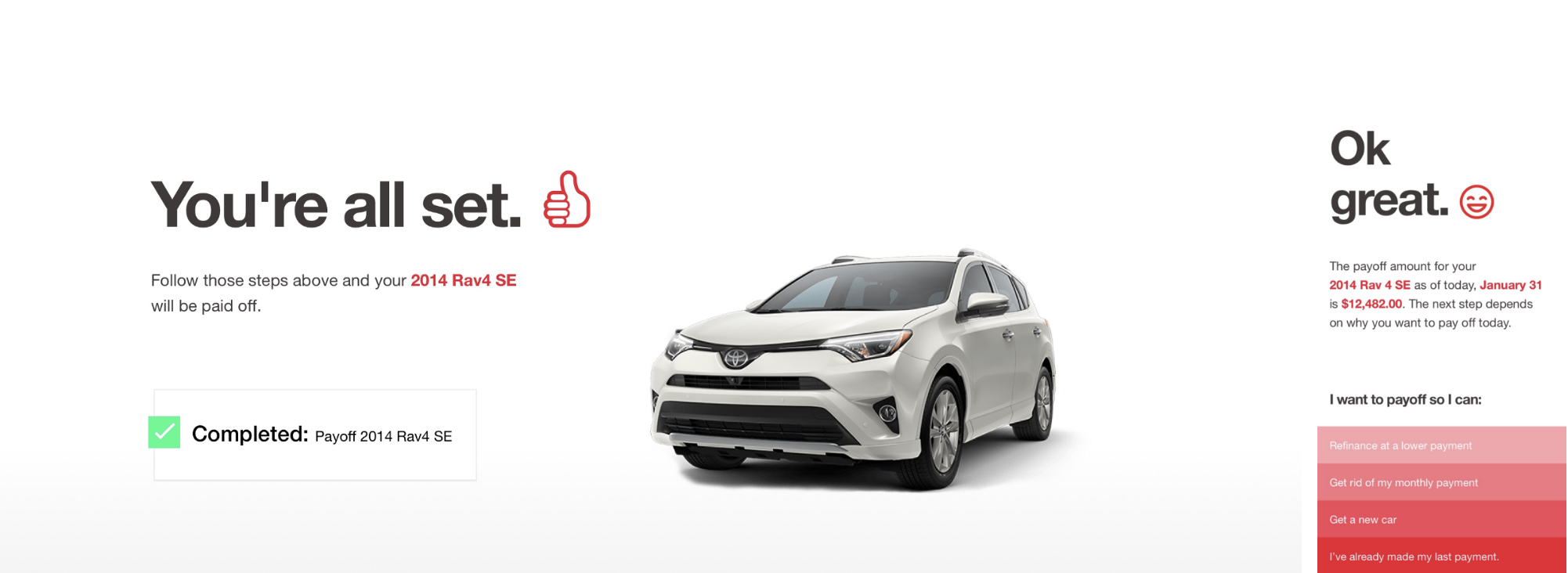
The back and forth of the user interacting with the UI as an entity was a really interesting idea. The user would get direct feedback as a result of an action taken and a natural progression would start to take shape. We’re bringing back the brand imagery in select places to try and add some emotion and to address the wishes of the product owner.
The emotion aspect is something we were also intrigued by. If this mentor is conversing with you, how would it convey emotion? We started down the path of exploring the use of emoji at key moments in the story. We would later abandon this idea because it was going to be too difficult to implement while staying on brand. But it was still an interesting experiment in telling the story.
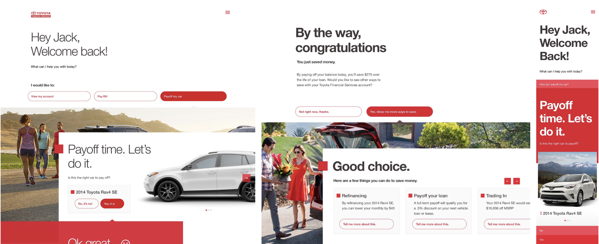
As the design system started to emerge we began building and experimenting with more components that could be slotted into this modular design motif that we decided to run with. As we continued down this line of thinking we started to run into some issues. Namely, that these pages had the potential to become heavy. They could get so large and unwieldy that to scroll back up into the experience was getting disorienting to users during testing. The other challenge was that if a user went 3 steps back, made a change to a form, then the rest of the information below that form would have to change and the page would rebuild itself as they began to navigate down the page. This was proving to be a challenge to users who worried about progress being “lost” as they saw it instead of what we were suggesting as simply a change in the conversation pattern. It was especially prevalent in a mobile environment as the users need to scroll increased with each step.
Below: Example of unwieldy page structure due to CMS constraints.

Product Iteration Three
Product Iteration Three
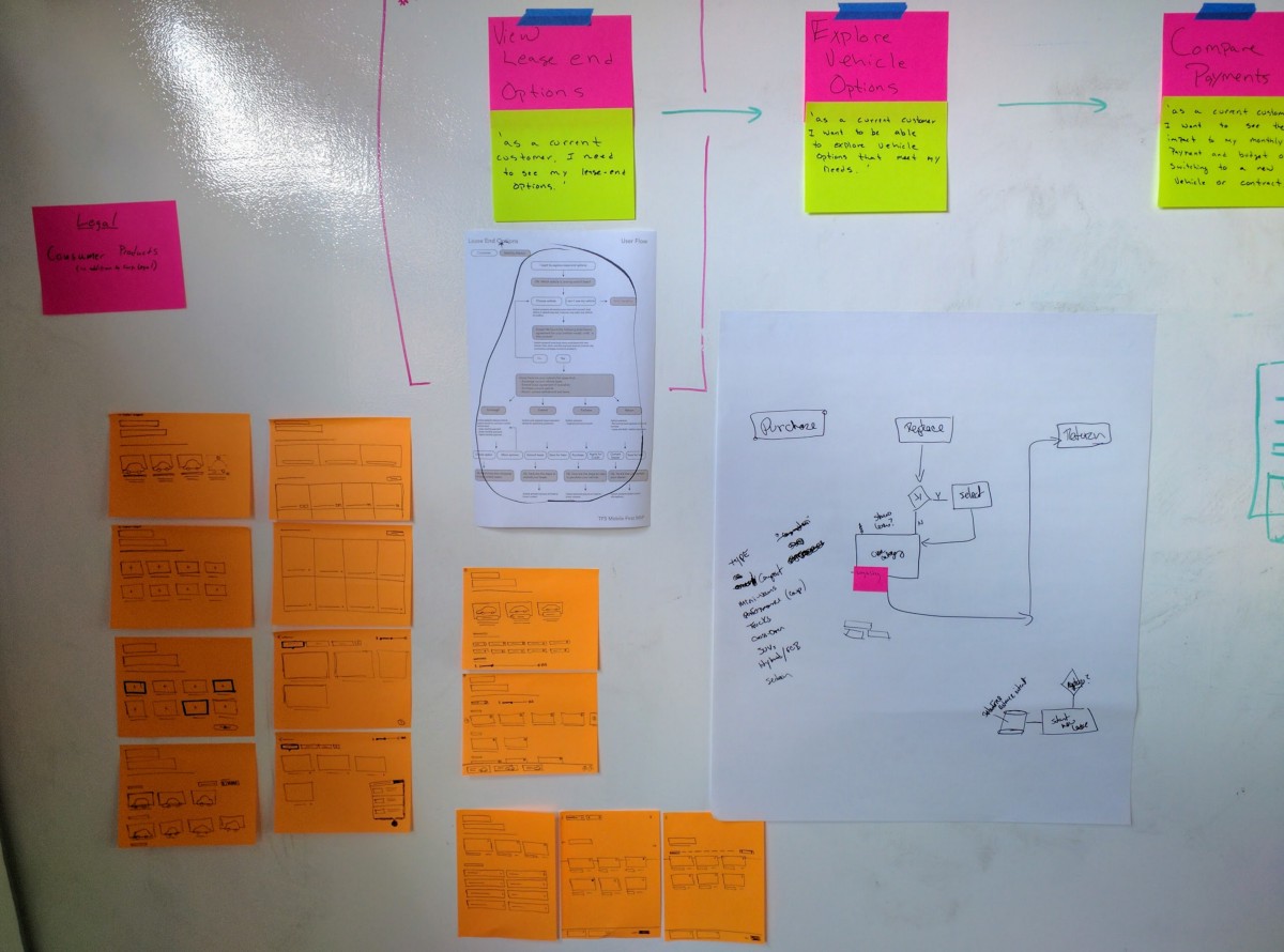
To begin this iteration, we decided to move away from a page that gets longer as the user takes action and pivoted into something with the same spirit but that was ultimately a more focused approach. After some more whiteboard sketching, we landed on a “mode” that is activated by a tile on the dashboard. When this conversation mode is initiated the user will then begin interacting with this new experience via a full screen take over. There is a back button to move back a step and a close button build in as an escape hatch if the user desires to go back to the dashboard. This approach allowed this conversation mode to be triggered from anywhere we needed it as it could be overlaid on top of any existing screen.
Below: The evolution of the whiteboard wall
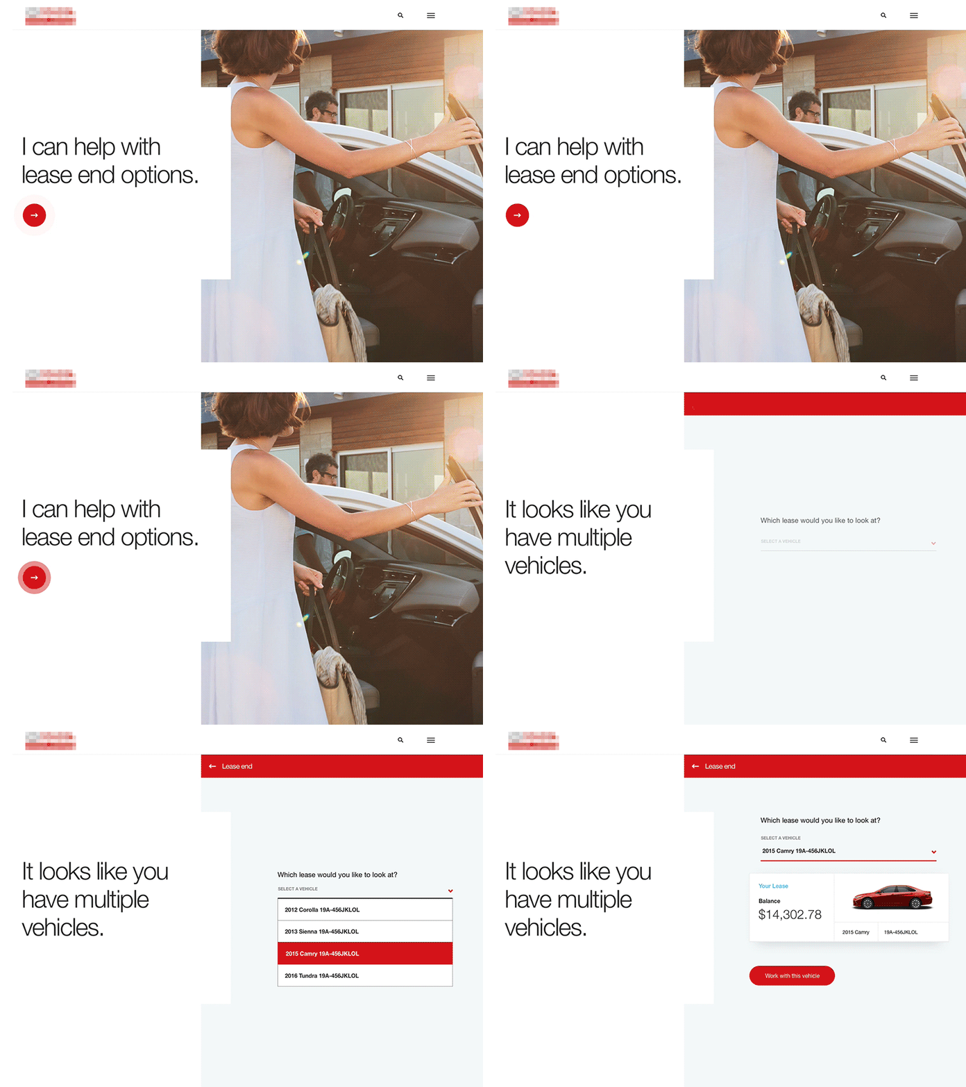
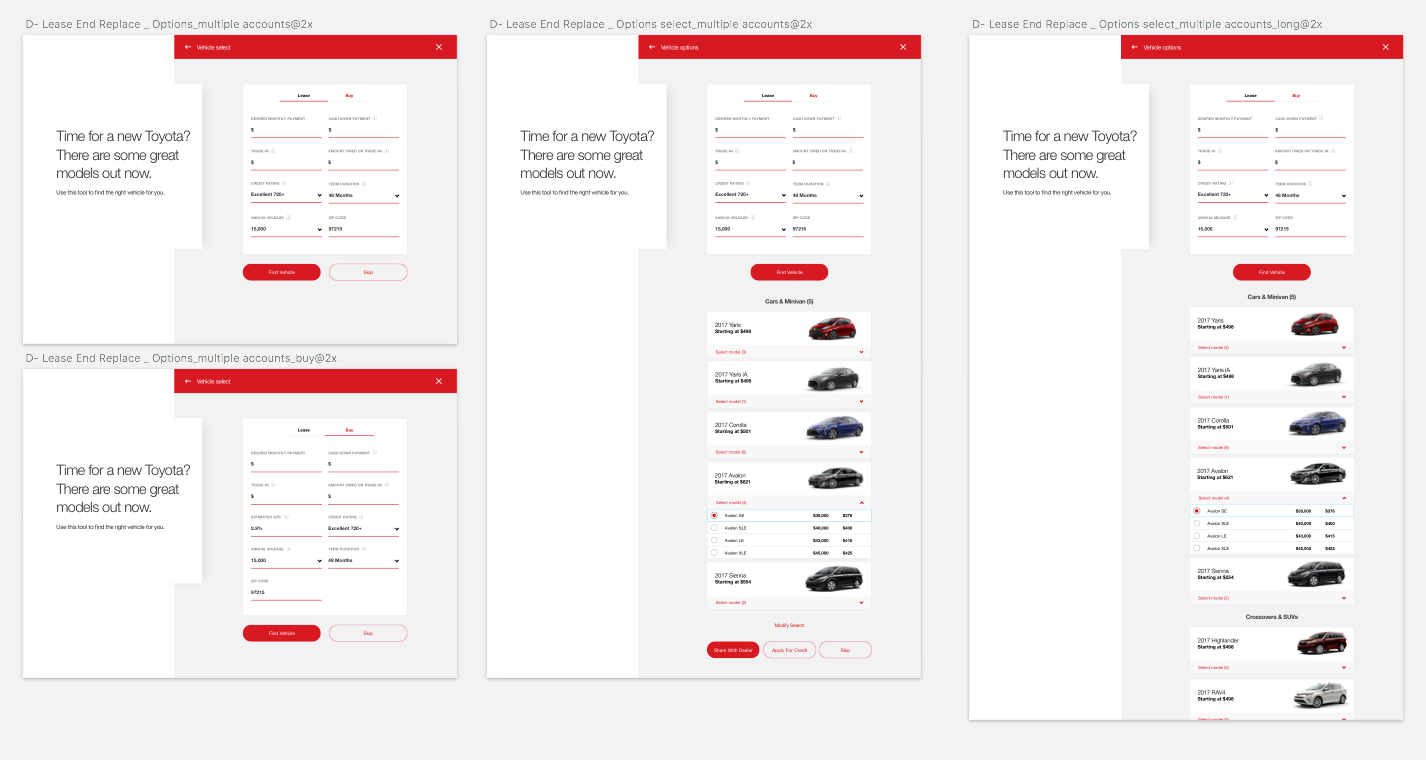
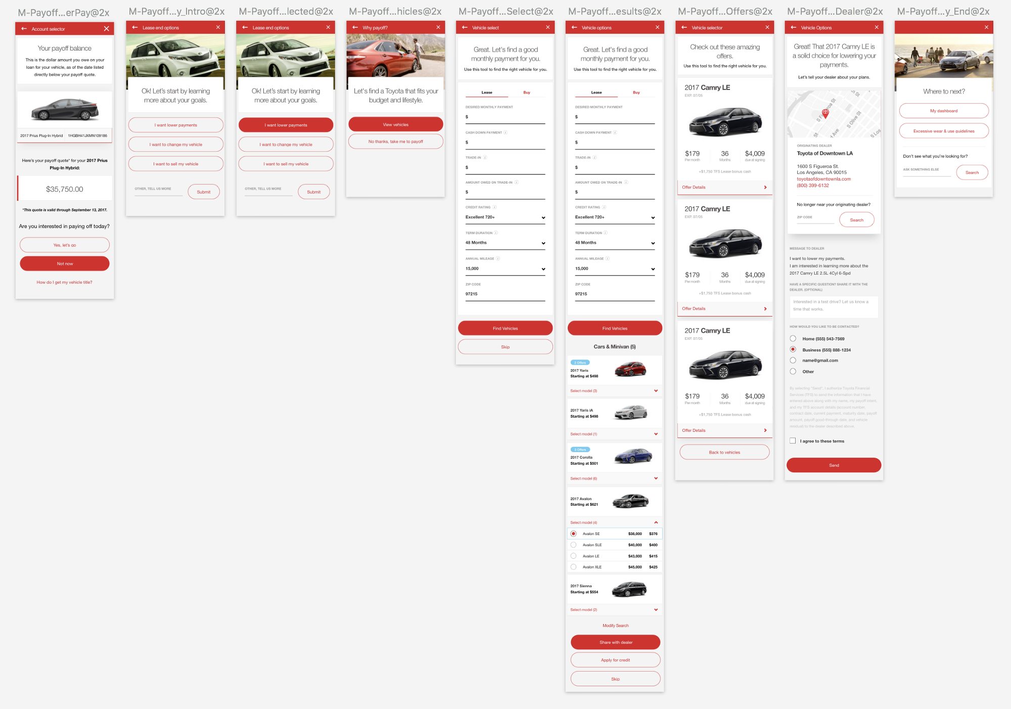
Now, the user doesn’t move down a page. They don’t really have the perception of moving at all. The page template remains largely consistent throughout the experience but only the components relevant to the conversation at hand are slotted in to the space in gray. The page is structured in a way that Toyota has a large card where they can “converse” with the user and anything that needs to be manipulated by the user takes place in the gray area. If they need to go back, then the back button takes them back to the previous screen with all of the information they previously provided still available. This made the structure much easier to parse for mobile users and started to become a more coherent design system.
Below: A few screens from the beginning of the new look for the conversation mode.
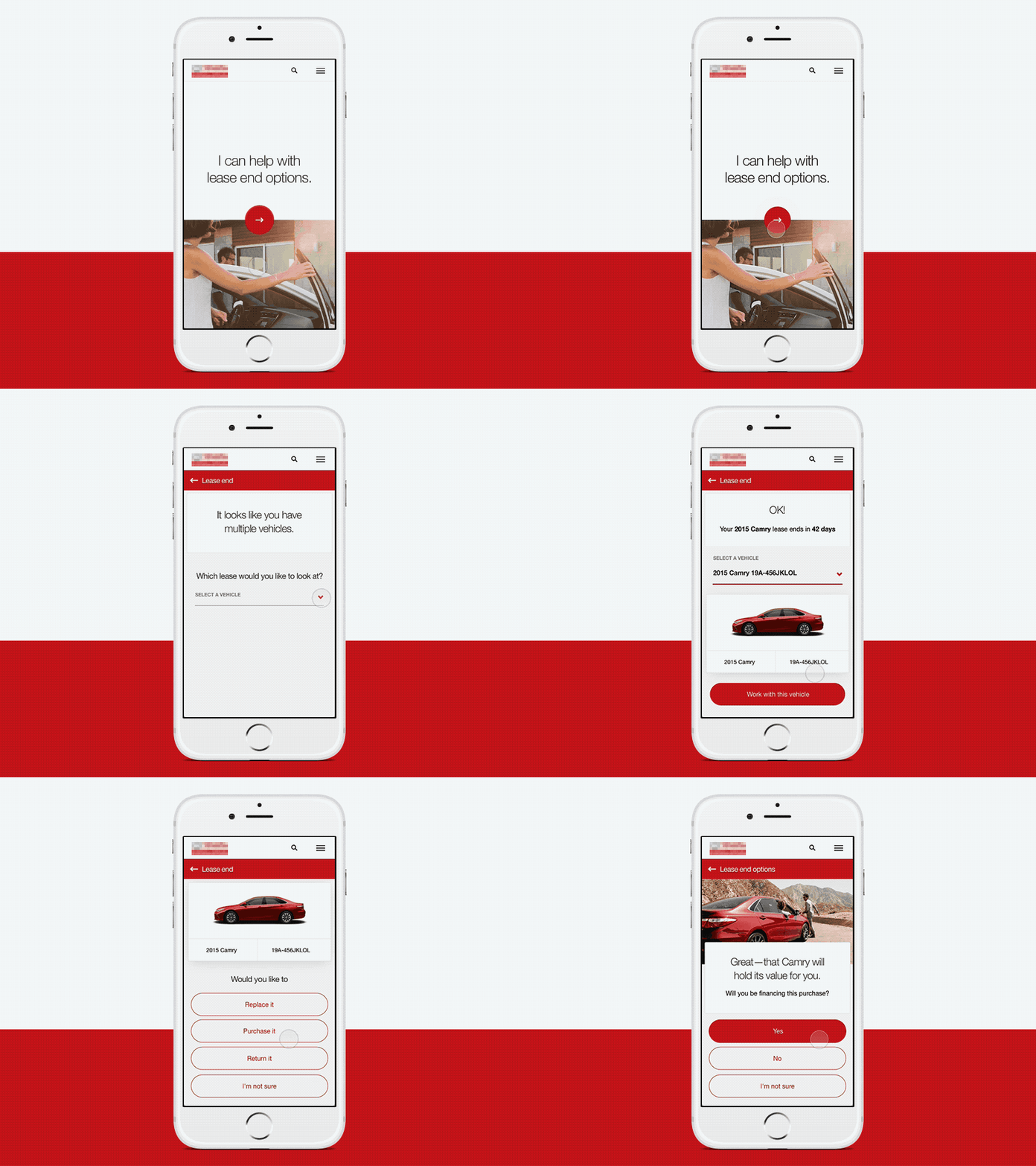
The challenge now was how does this work with page structure? We found out that each page needed it’s own URL to work with the CMS. After some digging our we found some examples of sites doing a similar thing. PayPal had a subsection of their site that had a full screen take over module that changed URL’s as you navigated through the experience. Now that we knew it could be done, we pushed forward.
The highlights from the user testing during this product iteration communicated that things were really positive. There were a lot of responses that they felt what they needed to do was always clear because of the way the UI focused them on doing a single task at a time. There were also comments describing how the process started to feel more personal.
Below: here’s a look at some more solidified design elements. The various page lengths represent scrollable information outside of the browser viewport:
The dashboard
The dashboard
The dashboard is seen as a crown jewel so to speak. It's the intersection of all of our work into one single hub. Everything needs to be accessible and the most important information needs to be the most visible. The goal for the dashboard was to give the user a home that would be both aspirational and convinient. The user has the ability to quickly make their payment while being exposed to an aspirational image of next years model. Being tile based made it easy to adapt for mobile screens and live data helps to give context to where the user is at on thier journey.
Below: Sketches for dashboard tile functionality. The one of the far right depicts the mileage tracker. Also, some early concepts for the dashboard.

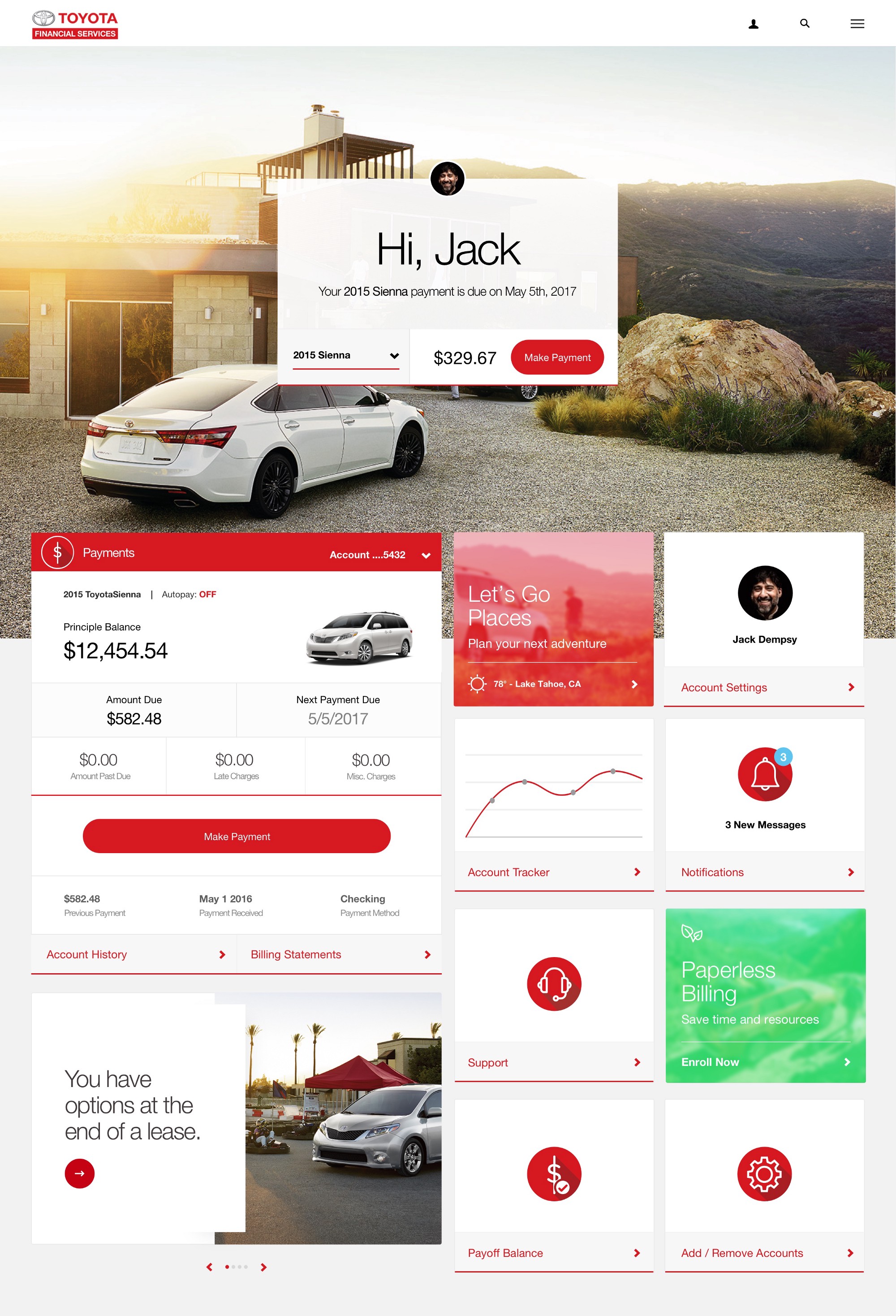
Above: Motion test for a scroll effect and what happens when a tile is selected. Notice how we indicate what starts triggers the conversation mode in the bottom left module.
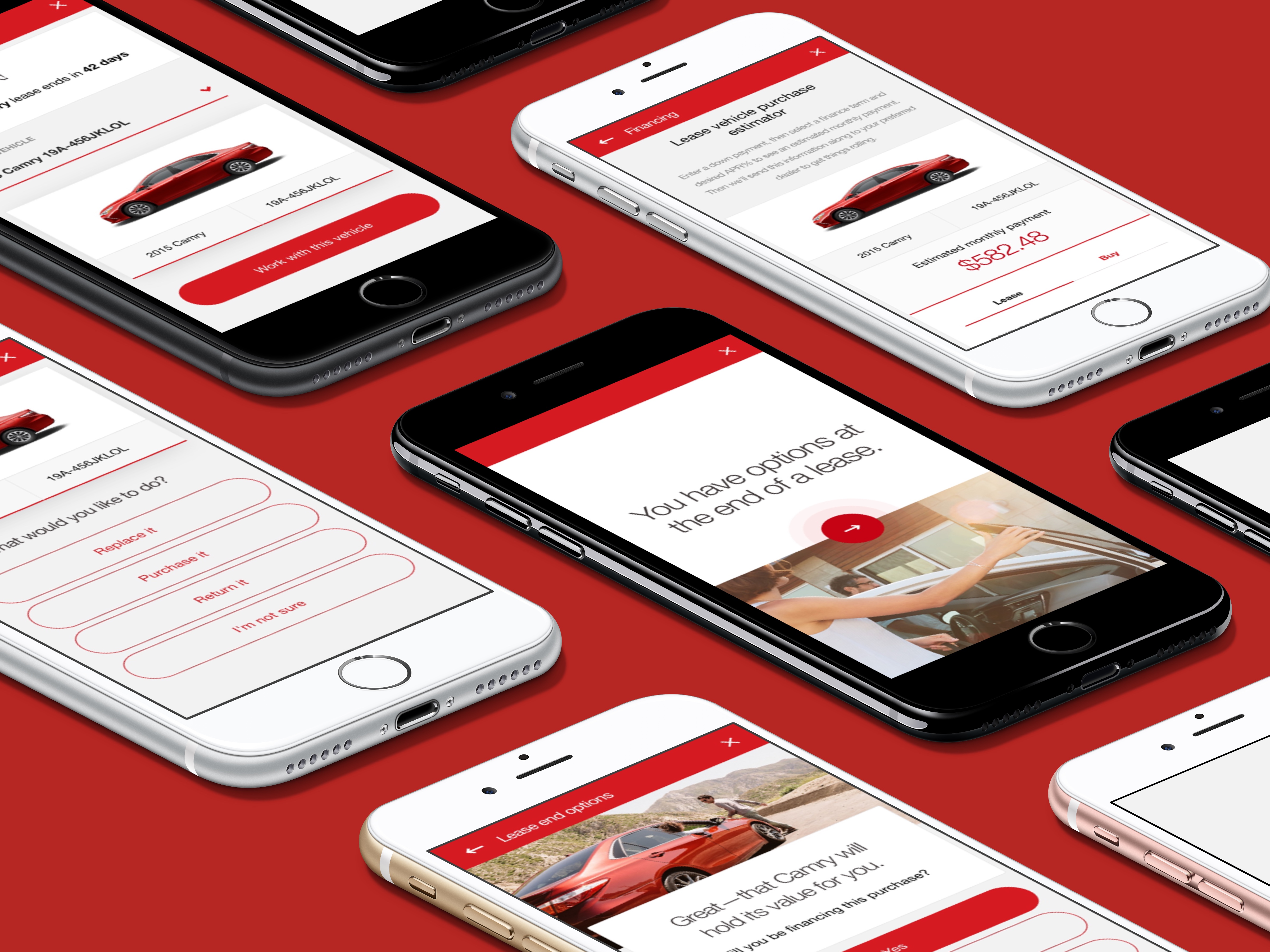
Final thoughts
Final thoughts
As we got further into the project and started to push more towards MVP we had to adjust course a few times to make sure we can stay on track for launch. Being flexible is a skill that I’ve cultivated and taken a lot of pride in over the years and it has served me well on this project. Requirements change, a lot. Budgets get adjusted. Stake holders go dark or take a lot of prodding to be responsive. Inter departmental disagreements on the client side cause delays. Being able to roll with those punches really helps me to say level headed throughout the process.
It was also reconfirmed to me how necessary it is for partnering with UX. Having a dedicated UX team member to work with not only sped up my process of iterating and prototyping but it made designing with content informed by user testing more feasible. We were able to share the burden. She understood how this thing works from front to back and I helped to build it and in time came to my own understanding of the inner workings. In essence, we could play to our strengths while acting as a sounding board or point of reference for the other person.
I took a pottery class in college. Working with clay was an interesting experience as I had come from an illustration background. My medium was paint not clay. So for me, trying to get something to take the shape I wanted it to take from this mound of clay was difficult. There were moments when I got something similar to what I wanted but there were other moments when the clay took it’s own form as I started to work with it. Projects like this remind me a lot of the latter experience. You can take it, form it, and mold it to what your vision is but in the end the product will start to take its own shape.
Chris Gilmore —
Fun Zone —